Mayor moves quick to begin city rebranding effort
By Charles Sercombe
In a move that surprised a number of residents, newly-elected mayor Adam Alharbi introduced new city logo designs.
And this was done in the first few weeks since Alharbi became mayor.
The immediate reaction on social media, however, was a big thumbs down.
“There is nothing wrong with the current logo. More distractions and wasting taxpayer money,” said Diane Elizabeth.
The initial designs offered by Alharbi featured an eagle motif that, for some, conjured up similar designs used by a certain 1930s German fascist party.
“Looks awfully WWII with Nazi undertones to me,” said Lynn Blasey.
The most frequent criticism was that the designs looked computer generated.
“Both of these are AI generated slop and it’s frankly disappointing and disrespectful to the artist community of Hamtramck which the city is known for having an amazing and vibrant artist community. There’s a right way and wrong way to do things and this definitely falls into the wrong way.” said Gracie Olivero.
Well, you get the drift — and so did Alharbi, who agreed to go back to the drawing board.
“You spoke, and we listened!” he said on Facebook. “We’ve taken your feedback from the previous round to refine our city logo. Hamtramck is a different city than it was 100 years ago, and we want a brand that reflects ‘The World in Two Square Miles’ as we know it today.”
So, Alharbi handed off the project to the Hamtramck Arts & Culture Commission.
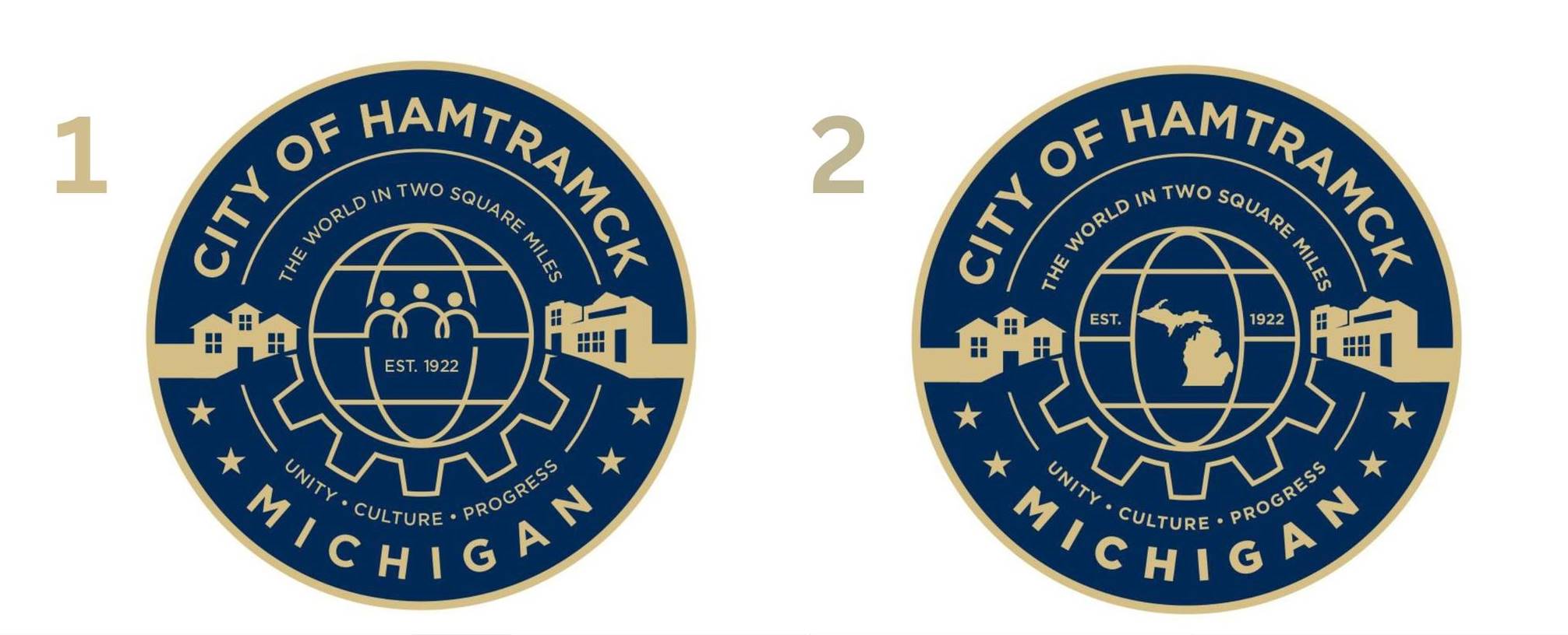
In the meantime, Alharbi unveiled a new round of designs.
And once again, the critics weren’t impressed.
“As a professional graphic designer with years of experience, I believe the previous Hamtramck city logo was far stronger,” said Bodrul Ahmen. “The new design appears rushed and lacks the research, creativity, and refinement that a city identity deserves. It could easily be perceived as generic or quickly produced rather than thoughtfully crafted.
“The former logo was distinctive, well-researched, and artistically strong. I strongly recommend retaining it unless a new design can meet or exceed that standard.”
So, just why did Alharbi undertake this project, especially when he’s just a few weeks in as mayor?
Here’s his explanation:
“The initiative to update our city logo is a key component of a broader rebranding effort aimed at moving Hamtramck forward. Like many progressive cities across the country, we are focused on modernization to better attract visitors and investors, while ensuring our visual identity is optimized for the digital age and social media. This rebranding direction was officially approved during our most recent City Council meeting.”
The mayor also points out that Hamtramck’s current city logo features a drawing of a factory – which, at one time, reflected the powerful muscle of industrial manufacturing here in town.
Those factories, especially the old Dodge Main, are now mostly long gone, although GM still has a plant that straddles the Detroit-Hamtramck border.
The idea of updating the city logo is nothing new. Former mayor Gary Zych, who is a metal sculptor, proposed adopting a new city logo back in the late 1990s.
That idea fizzled out, but the thought has come up here and there again since then.
The concept of “branding” that Alharbi mentioned is one of the buzz words that today’s urban planners use to re-imagine a city’s identity for a modern audience – and, especially, potential investors.
In an AI overview, it’s explained this way:
“Urban planners increasingly use city branding as a strategic tool to define a city’s unique identity, enhancing its global competitiveness to attract investment, tourism, and talent.”
Still, some insist there is no need to modernize.
“What’s wrong with the original?” asked former City Councilmember Julia Boluk.
Posted Jan. 31, 2026